
Typefaces
Typography is a core element of the Cañada College visual identity. By consistently using our primary and supplemental typefaces, we ensure that all college communications maintain a recognizable voice. Our brand relies on the balance between tradition and modern style, achieved through the pairing of a classic serif and a versatile sans-serif. The two primary typefaces for Cañada College are:
Primary Typefaces:
- Garamond: Cañada's main font.
- Franklin Gothic: Secondary font.
Garamond:
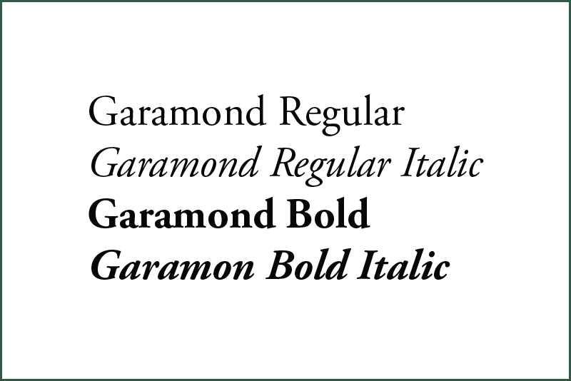
Garamond is the foundation of our visual brand and the font used in the Cañada College logo. If Garamond is unavailable, please use the font Adobe Garamond Pro or ITC Garamond.
-
Classification: Serif
-
Characteristics: It features "serifs," which are the small lines or "strokes" at the end of the larger lines within each letter.
-
Usage: Best used for formal headings, the college logo and instances where a traditional, academic and elegant tone is required.
Franklin Gothic:
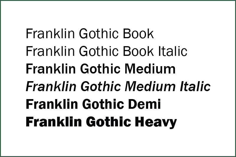
Franklin Gothic serves as our flexible, modern companion to Garamond. It is a highly readable font that works across a variety of digital and print applications.
-
Classification: Sans-Serif
-
Characteristics: This font does not contain the extra small lines at the ends of the strokes ("sans" meaning without). This results in a more modern appearance.
-
Usage: Ideal for body copy, digital interfaces, subheaders and technical documents where clarity is needed.
Garamond and Franklin Gothic are both used in Cañada College department/service logotypes or sub-branding logos. When working with printed materials, Garamond or Franklin Gothic fonts are preferred. Please use these two main Cañada College fonts, or similar ones, whenever possible. If Garamond is unavailable, please use the font Adobe Garamond Pro or ITC Garamond.
Serif vs. Sans-Serif
The primary difference between these two categories is the presence of serifs, which are the small decorative strokes or "feet" found at the ends of letter stems.
Serif Fonts (e.g., Garamond)
These fonts have small decorative lines attached to the ends of their letters. Serifs are often associated with history, authority and tradition. In long-form printed text, like books or newspapers, serifs help guide the eye along the line, making large blocks of text easier to read.
Sans-Serif Fonts (e.g., Franklin Gothic)
"Sans" is French for "without." These fonts don't have the extra decorative strokes. Sans-serif fonts offer a clean, minimalist and efficient look. Because they lack fine details that can blur on low-resolution screens, sans-serif fonts are the standard choice for websites, apps and digital interfaces.
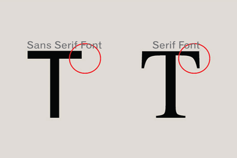
For digital or web content, a sans-serif font is always the best option for maximum readability and accessibility. For the Cañada College website, Open Sans is the preferred font.